
Marketing Website Redesign
May 2025 (1 month project) • Solo Designer with CEO
Summary
I redesigned the usability testing platform ‘Hubble’ marketing website. The old site lacked clear messaging, visual consistency, and persuasive flow. Working with the CEO, I restructured both the design and content strategy to better communicate Hubble’s strengths as an all-in-one usability testing platform and drive conversions.
Challenge
Conversion gap: Despite steady traffic, trial sign-ups and demo requests were underperforming.
Unclear messaging & weak hierarchy: Visitors struggled to quickly understand what Hubble offers, while product strengths were buried in copy that lacked a persuasive narrative.
Limited time and resources: With no marketing team and no development support, we relied fully on Webflow. This meant I had to quickly learn and continuously use a tool while balancing all design and content responsibilities.
Outcome
Achieved a 2x increase in trial sign-ups and demo requests within one month of relaunch.
Simplified messaging and restructured menu structure and content hierarchy so visitors could quickly grasp Hubble’s offering and strengths.
Delivered a full redesign by independently mastering Webflow, establishing a scalable system that the team could maintain without engineering resources.

Current Website Audit
I began by framing some fundamental questions:
When someone lands on our site, is it immediately clear what we offer and how we’re different?
Does the structure and layout help users navigate with clarity and confidence?
Do visuals, copy, and messaging work together to build trust and reflect our value?
The answer was largely no.
The site didn’t clearly articulate what made us different from other usability testing platforms.
The menu and information architecture didn’t reflect the way our product is actually structured.
Key visuals felt disconnected from the platform itself.
Typography, spacing, and alignment were inconsistent.
Mobile layouts were broken and unstructured.
This showed me that before any redesign, we needed to clarify who we are, what we offer, and how to communicate it consistently.
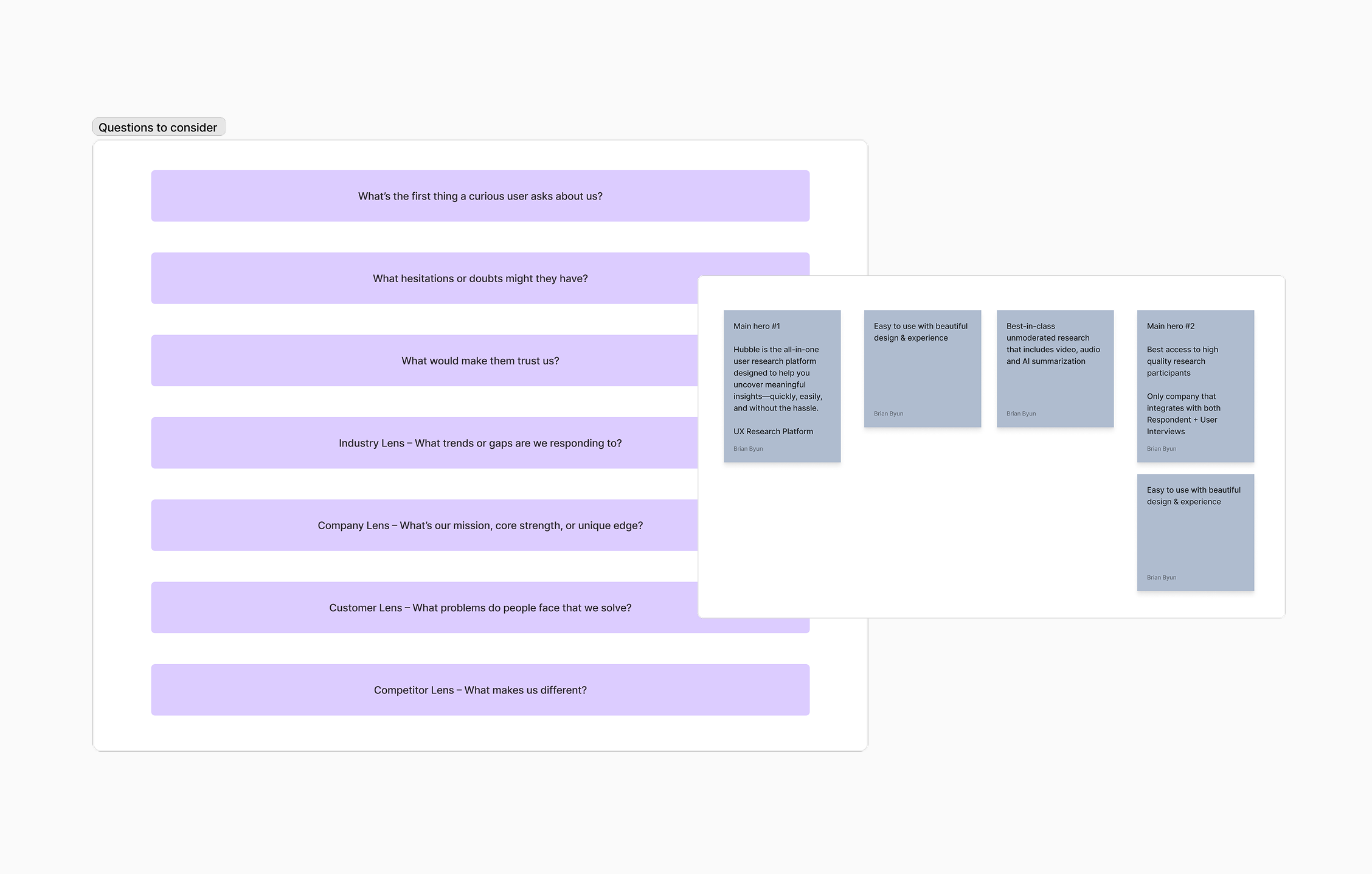
Defining Value
When I asked our CEO simple questions — What do we offer? Why do we matter? Who are we for? — The answers were vague.
To move forward, I facilitated workshops to sharpen this foundation

Discovery Workshop
The workshop surfaced key insights:
Target audience: UX Researchers, Designers, Marketers, and PMs.
User struggles: Lack of time, resources, or clarity to run research efficiently.
Where competitors fail: Tools are too complex or too expensive for small/fast-moving teams.
Our unique value: Speed, simplicity, and end-to-end usability.
This gave me a clear north star for design decisions: make research feel simple, approachable, and fast.

Tone & Voice Workshop
To build trust, the product needed a consistent personality.
If Hubble were a person: a friendly, helpful teammate — someone who makes UX research simple and approachable.
Tone of voice: Friendly and clear. Avoid sounding confusing, pushy, or overly technical.
This informed not only copywriting but also the design style and interaction patterns.

Prioritizing Redesign Scope
Given time constraints, I had to decide where to start. I evaluated the site structure: Home, Why Us, Product (features), and Resources.
Home & Why Us needed a strong understanding of all features, so I saved those for later.
Product (features) required a full IA restructure and new content — a heavy lift.
Resources already had content but needed consistency and structure.
I started with Resources pages as a quick win: high visibility, lighter content demands, and an opportunity to establish reusable design patterns.
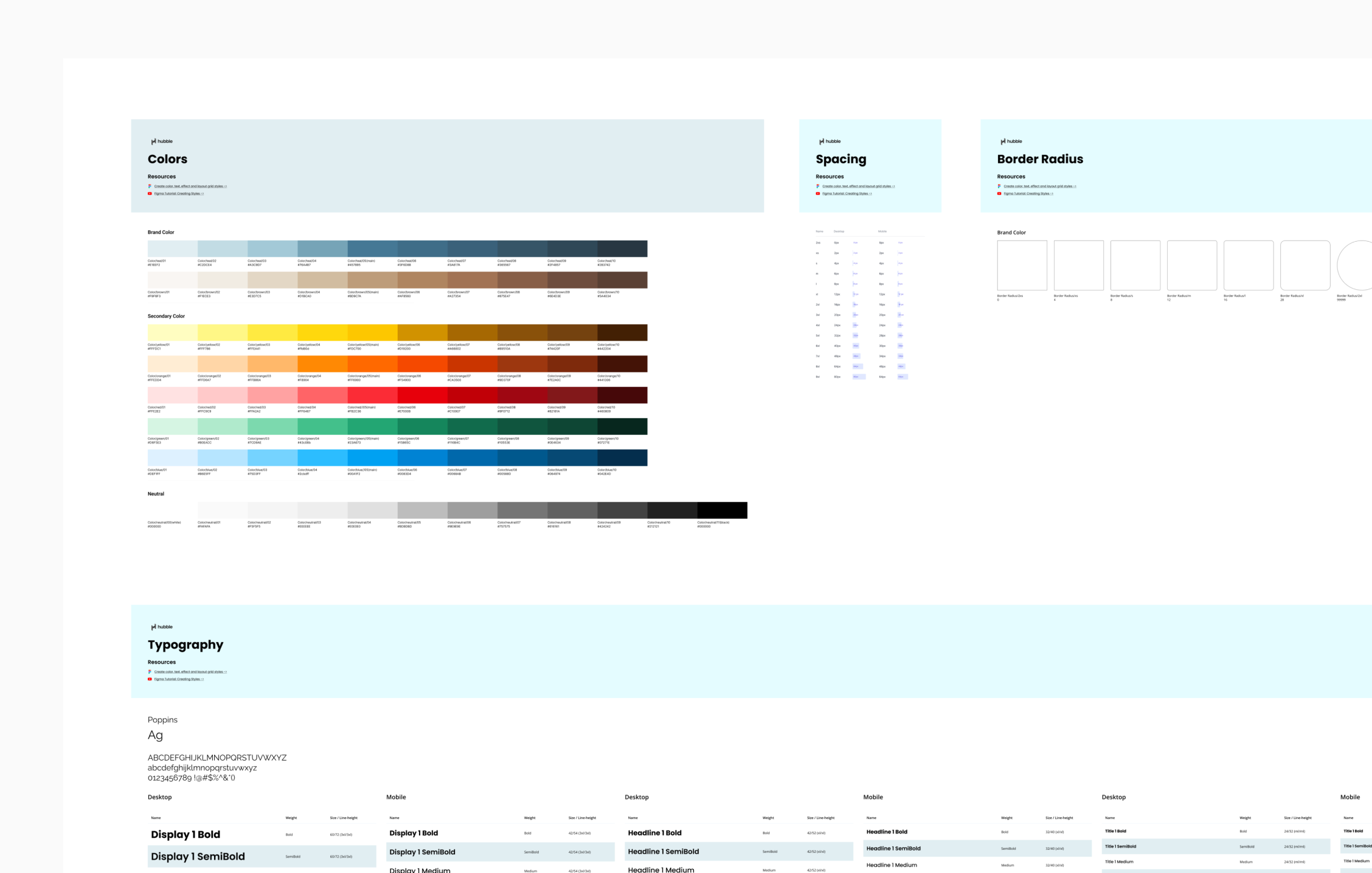
Building a Design System Foundation
While planning, I also set up a lightweight design system in Webflow to drive efficiency and consistency across the redesign:
Colors
Typography (desktop & mobile)
Spacing scale (desktop & mobile)
Border radius
Icon set
Learning Webflow while building these foundations made later iterations faster and ensured design consistency across the site.
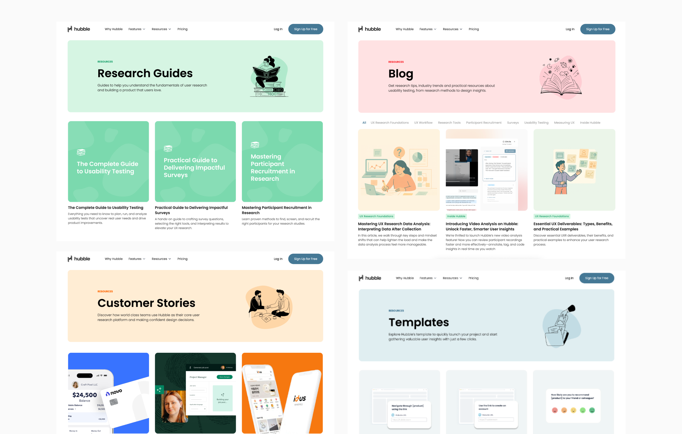
Resources Pages
By analyzing existing layouts, I identified repeatable patterns:
Page headers
Content boxes (image + title + description, with variations)
Scroll-to-view designs
I built these as components with variations, enabling me to quickly apply them across multiple Resources pages.

Blog
During the Resources redesign, I realized the blog was a key traffic source — many visitors discovered us through Google searches about usability testing. However, the blog had poor navigation and didn’t inspire trust, leading to low conversions.
I researched how other companies design blogs and pulled out patterns:
Clear title + short description upfront
Sticky navigation for easy browsing
Author info (name + job title) to add credibility
The goal was to make visitors feel they were reading expert insights from real practitioners at our company — positioning us as a trustworthy research platform.
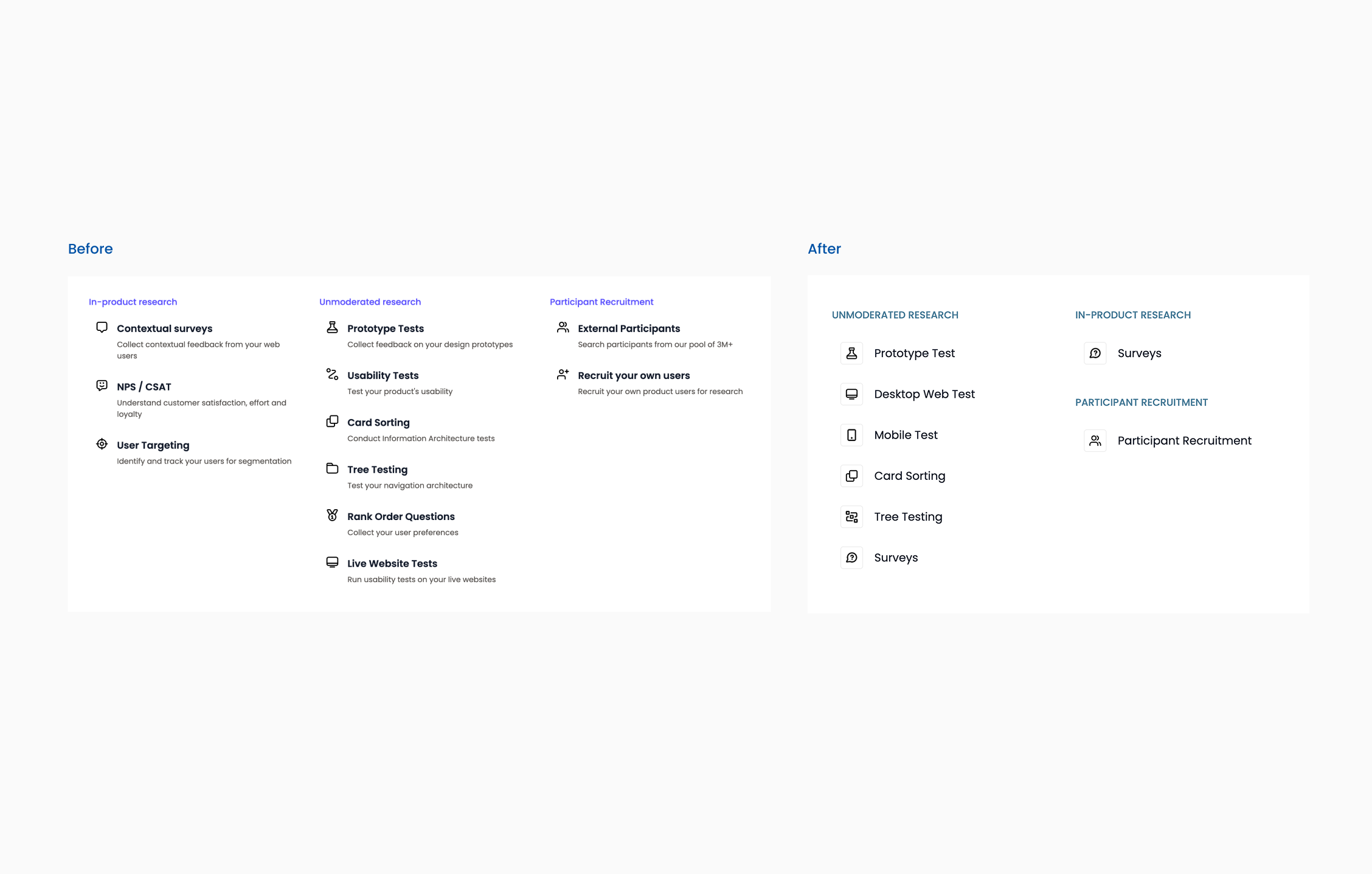
Product Pages (Features) Information Architecture
The Product section was the most complex. The existing IA didn’t match how the product actually worked, creating confusion. My approach:
In-product Research: Low adoption, overlapping content → consolidate into one “Survey” page.
Unmoderated Research: Misaligned categories (e.g. “usability testing” as an umbrella, “rank order” separated) → restructure pages to directly match the product’s actual feature terminology.
Participant Recruitment: Our true differentiator (integration with User Interviews & Respondent) was hidden → created a single, focused page highlighting trusted recruitment without leaving our platform.
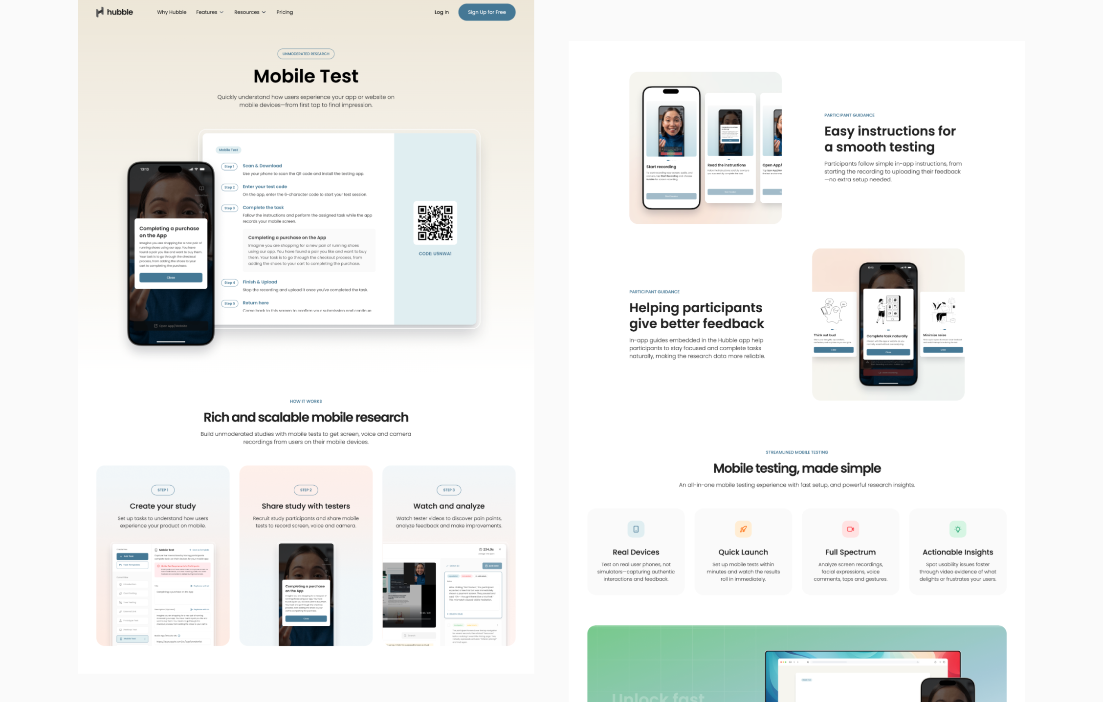
Product Pages (Features)
Header
Challenge: Users often don’t trust new platforms if they can’t visualize the product.
Strategic decision: I framed each feature with clear titles and large screenshots, prioritizing clarity over clever marketing copy.
Outcome: Visitors immediately understood what each feature did and were reassured by seeing the actual product.
3 Step Guidance
Challenge: Complex workflows create hesitation to try a new tool.
Strategic decision: I simplified each flow into three clear steps to signal “this is easy” and align with our brand of speed.
Outcome: Lowered perceived complexity and positioned Hubble as approachable and fast to adopt.
Strengths
Challenge: Competitors have long feature lists; we needed to show why we’re different.
Strategic decision: I placed Hubble’s differentiators right after ease-of-use proof points.
Outcome: Prospects connected our unique strengths to real advantages, not just marketing claims.
4 Highlights
Challenge: Many decision-makers skim instead of reading in detail.
Strategic decision: I distilled benefits into four icon-based highlights for quick scanning without losing substance.
Outcome: Increased time-on-page and ensured even skimmers left with a clear sense of our value.
Request Demo CTA
Challenge: Users often got interested but didn’t know the next step.
Strategic decision: I anchored every page with a bottom CTA, timed to appear after enough context had been given.
Outcome: Reduced drop-off and increased demo requests by meeting users at the right moment.
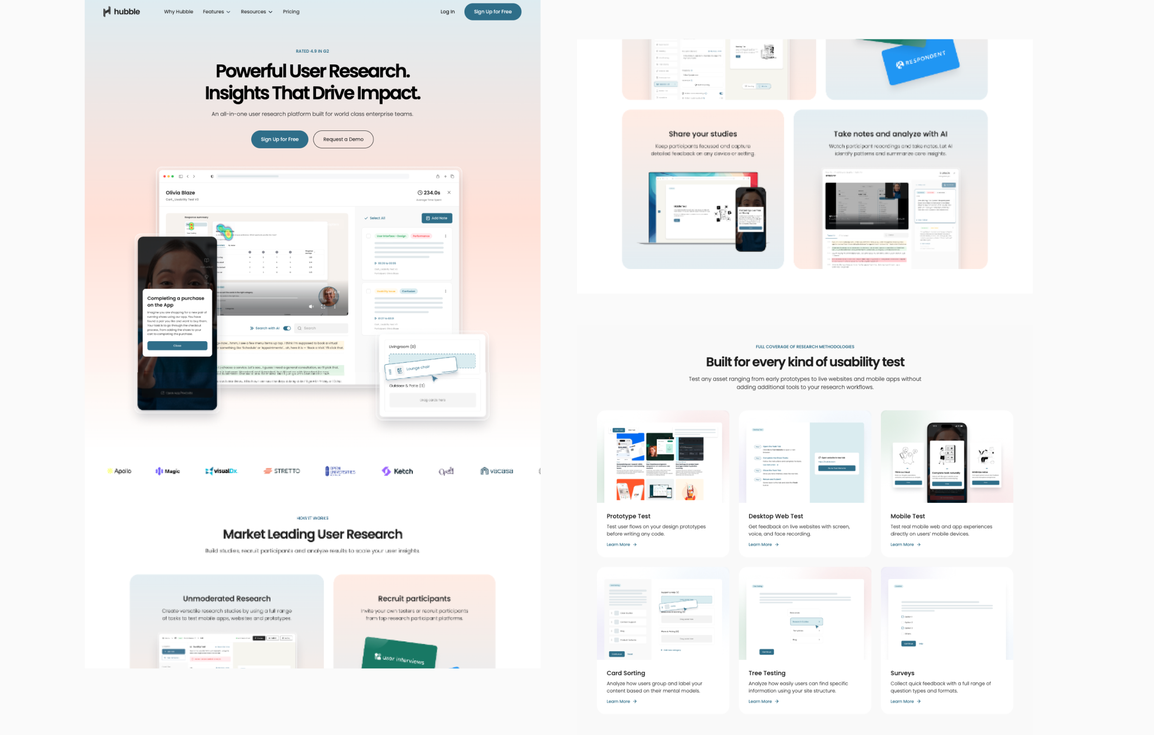

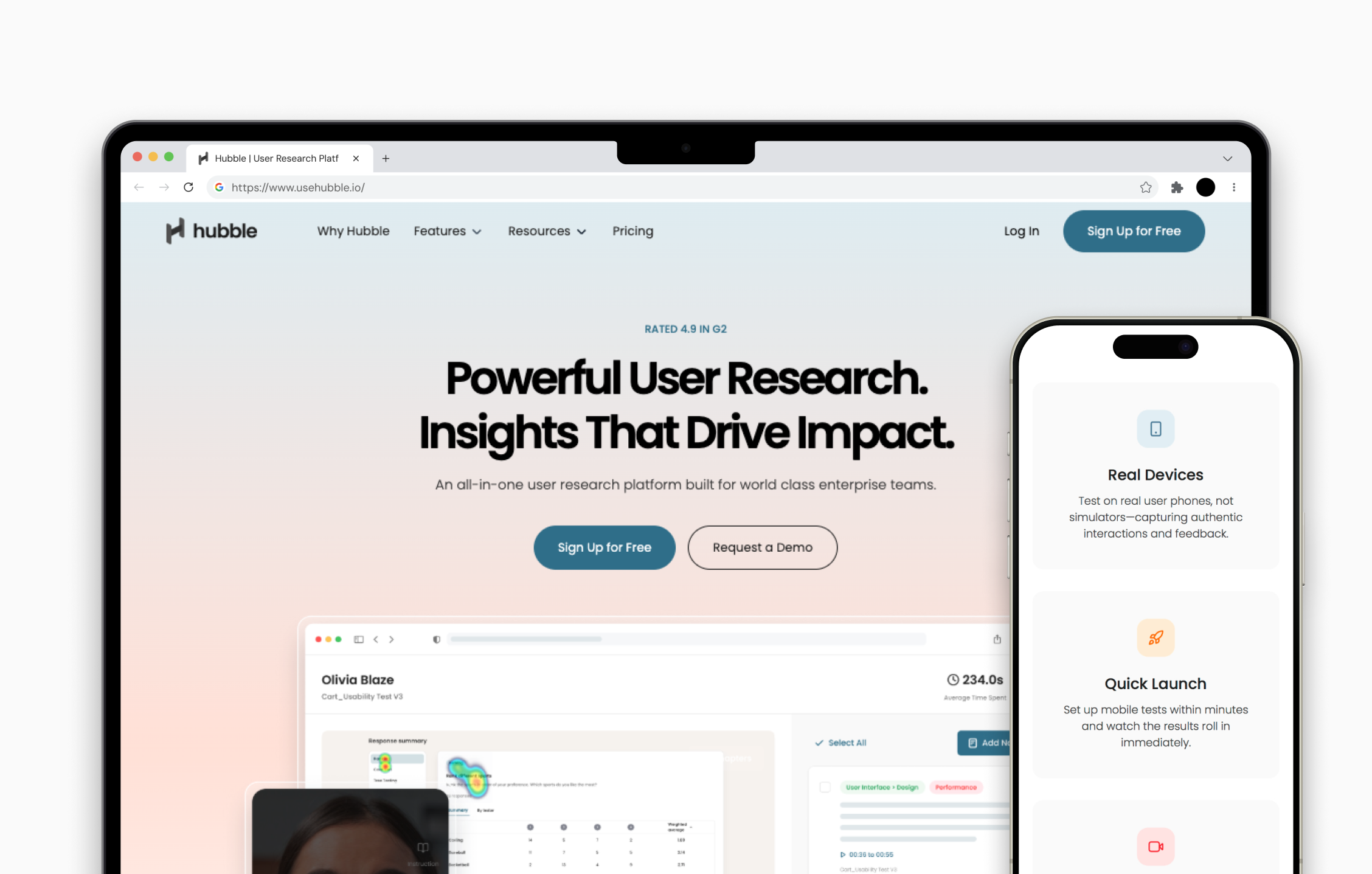
Home Page
Hero Section
Challenge: Many tools highlight one feature, creating a perception of being “just another point solution.”
Strategic decision: I showcased all usability testing types upfront to establish Hubble as comprehensive from the start.
Outcome: Visitors immediately saw Hubble as an all-in-one platform, not a niche tool.
4 Step Guidance
Challenge: The end-to-end research journey feels overwhelming for first-time visitors.
Strategic decision: I mapped the process into four intuitive steps to frame it as structured and achievable.
Outcome: Visitors quickly grasped our complete value, reducing hesitation to continue exploring.
Feature Cards
Challenge: Users struggled to discover what features we offered from the menu alone.
Strategic decision: I designed clickable cards with short descriptions to make all features visible on one page.
Outcome: Improved discoverability and reduced navigation friction, helping users dive into areas relevant to them.
Strengths
Challenge: Abstract claims about “why we’re better” often get ignored.
Strategic decision: I positioned differentiators directly in the research workflow context so they felt real and actionable.
Outcome: Prospects trusted our claims because they were tied to tangible use cases.
Additional Features
Challenge: Secondary tools risked distracting from the core story.
Strategic decision: I placed them after the main narrative, framed as “bonus value” for those interested.
Outcome: Users discovered extras naturally, strengthening the sense of product depth without clutter.
Testimonials & Logos
Challenge: As a startup, we needed to build credibility quickly.
Strategic decision: I used auto-scrolling testimonials and logos to project social proof and scale.
Outcome: Helped overcome trust barriers, making us feel established despite limited client numbers.
Request Demo CTA
Challenge: Many users read through the content but didn’t know the next action.
Strategic decision: I reinforced the CTA at the bottom of the journey, after trust-building sections.
Outcome: Captured interest at the peak moment, converting curiosity into action.
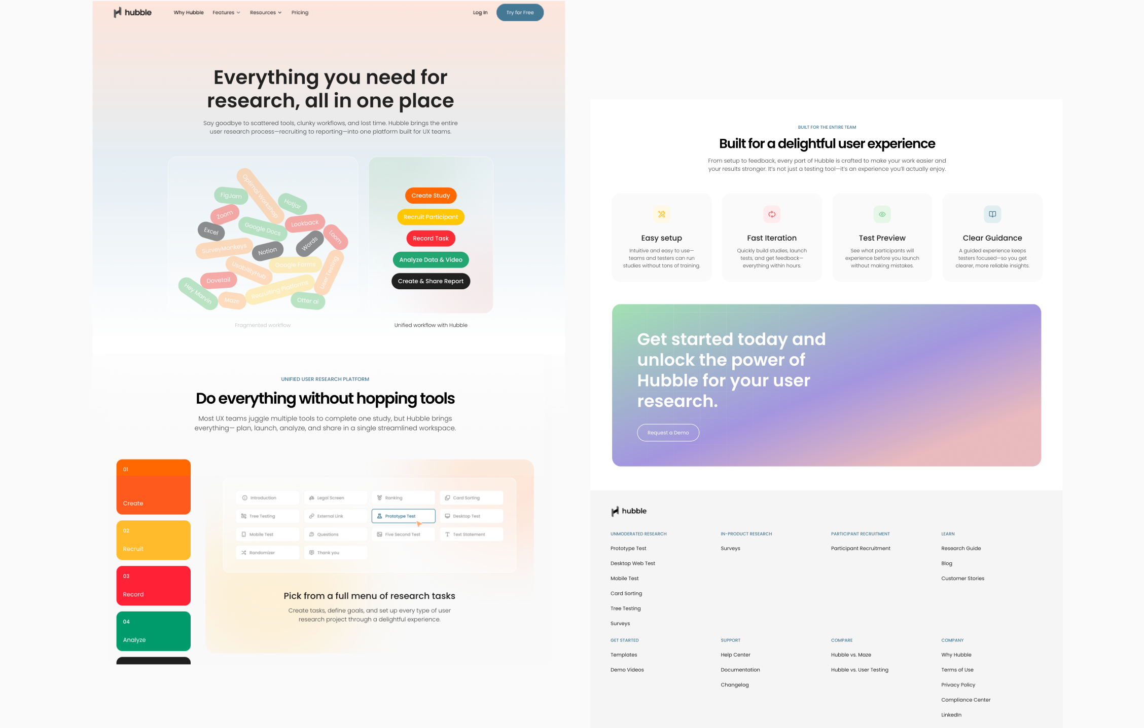
Why Hubble Page
Hero Illustration
Challenge: Visitors needed to understand why Hubble mattered compared to competitors.
Strategic decision: I designed an illustration contrasting fragmented tools with our unified flow.
Outcome: Users instantly grasped our unique value without heavy reading.
Step Guidance
Challenge: Even with the “all-in-one” message, users worried about complexity.
Strategic decision: I broke down each stage with simple visuals to show not just the whole flow, but the simplicity of each step.
Outcome: Users felt confident that adopting Hubble wouldn’t mean retraining or steep learning curves.
4 Highlights
Challenge: Decision-makers wanted a concise rationale for choosing us.
Strategic decision: I condensed differentiators into four scannable highlight cards with icons.
Outcome: Busy executives could quickly absorb our core advantages, supporting faster buy-in.
Request Demo CTA
Challenge: Prospects needed a clear, easy way to act after understanding our value.
Strategic decision: I ended with a strong demo request CTA to close the comparison story with action.
Outcome: Turned interest into conversions at the most persuasive moment.
ⓒ Jeany Lee - All rights reserved
